
The color of your surroundings really does affect you.
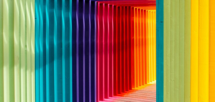
Colors are much more than mere visual stimuli; they have the power to shape our emotions, behavior, and even our physical well-being. The psychology of color is an increasingly recognized field in health and wellness, influencing everything from interior design and branding to therapeutic environments. Whether it’s the calming hues of a doctor’s office or the energizing shades of a fitness studio, the colors around us have a profound effect on our mental and emotional state. In this article, we explore how different colors impact mood and well-being, and how we can use color intentionally to create spaces that promote health.
The Science Behind Color and Emotion
Our emotional responses to color are not entirely random. The human brain is hardwired to associate certain colors with specific moods, thanks to evolutionary biology and cultural influences. For example, we associate blue with calmness because blue skies and bodies of water often signal tranquility and safety. On the other hand, red, a color associated with fire and blood, can evoke excitement, urgency, or even aggression.
Research has shown that colors can influence brain activity, trigger hormone releases, and even alter our perceptions of time. Color perception also varies from person to person, depending on cultural backgrounds, personal preferences, and experiences. Nonetheless, several general trends are commonly observed across populations. Let’s dive into how these colors can impact health and wellness.
1. Blue: Calm and Focus
Blue is often regarded as one of the most calming colors. It is commonly used in healthcare settings such as hospitals and therapy offices because of its soothing effect on the mind and body. Studies have shown that blue can lower blood pressure, slow the heart rate, and reduce feelings of anxiety.
From a psychological standpoint, blue is associated with tranquility, trust, and clarity. It encourages a peaceful environment, which can enhance concentration and reduce stress. In workspaces or homes, incorporating shades of blue, especially soft blues or pastel tones, can help promote a sense of relaxation and mental clarity.
However, too much blue in a space can lead to feelings of isolation or coldness, so it’s often recommended to combine blue with warmer tones for balance.
2. Green: Healing and Harmony
Green is the color of nature, and for good reason—it has a profound impact on health and well-being. Research suggests that exposure to green spaces can reduce stress, promote healing, and even improve cognitive function. This is why hospitals often incorporate plants or use green in their design. Green is also associated with balance and renewal, which makes it an excellent choice for spaces intended to foster recovery or relaxation.
Green can create a sense of harmony and connectedness with the natural world, reducing mental fatigue and promoting a sense of well-being. Whether it’s a green-painted wall or indoor plants, this color can help restore energy, soothe the nervous system, and contribute to a more balanced mental state.
3. Yellow: Optimism and Energy
Yellow is an energizing and stimulating color, often associated with happiness, optimism, and creativity. Bright yellow tones can help lift spirits, promote positive thinking, and increase alertness. This is why yellow is often used in classrooms, studios, and places where mental stimulation is encouraged.
However, it’s important to use yellow carefully, as too much of it can have the opposite effect. Overexposure to bright yellow can be overwhelming and cause feelings of frustration or anxiety, especially in large doses. It’s best to incorporate yellow as an accent color in spaces where energy and focus are needed, such as kitchens or workspaces, rather than using it as the dominant hue.
4. Red: Passion and Action
Red is a powerful, attention-grabbing color that can increase energy, excitement, and even alertness. It is linked to physical stimulation and heightened emotions, making it ideal for areas designed to encourage activity and motivation. In the context of health, red is often used in spaces dedicated to physical activity, like gyms or fitness studios, because it can boost energy levels and encourage movement.
However, too much red can induce stress or anxiety. The color’s intensity is linked to increased heart rate and adrenaline production, which is why it’s important to use red sparingly. Red accents or subtle touches can be effective for stimulating action, but overwhelming amounts of red may create feelings of irritability or agitation.
5. Purple: Calm, Creativity, and Spirituality
Purple combines the calm stability of blue with the passionate energy of red, making it a complex and versatile color. Lighter shades of purple, such as lavender, are often used in therapeutic spaces due to their calming and soothing properties. Purple is also associated with creativity, spirituality, and transformation, making it a popular choice for meditation or yoga rooms.
Research suggests that purple can promote relaxation while also fostering a sense of inner peace and clarity. However, darker shades of purple may evoke feelings of luxury or introspection, which might not always be conducive to relaxation. As with red, moderation is key when incorporating purple into an environment.
6. White: Cleanliness and Clarity
White is often associated with purity, cleanliness, and simplicity. It can create a sense of spaciousness, light, and clarity, making it a common choice for healthcare environments like hospitals and clinics. White encourages a sense of order and organization, which can be particularly calming in medical or clinical settings.
However, too much white can feel stark or sterile, leading to a sense of emptiness or detachment. When used excessively, white may also lack warmth, so it’s typically best to pair it with softer tones, natural materials, or green plants to avoid feelings of coldness.
7. Orange: Warmth and Vitality
Orange is an energetic, vibrant color that combines the warmth of red with the cheerfulness of yellow. It is often used in spaces where people need a boost of motivation and enthusiasm, such as kitchens, playrooms, or gyms. Orange is associated with vitality, enthusiasm, and a sense of adventure.
That said, because of its intense nature, orange should be used thoughtfully. Too much bright orange can be overstimulating, leading to restlessness or irritability. Subtle orange accents or softer tones can be more effective at promoting energy without overwhelming the senses.
8. Pink: Compassion and Comfort
Pink, often seen as a softer, gentler version of red, is associated with compassion, nurturing, and emotional comfort. It’s often used in spaces intended to promote relaxation, healing, and emotional balance. Soft pink hues can encourage feelings of tenderness, making them a popular choice for bedrooms, counseling centers, and spaces designed for self-care.
While pink can foster a sense of warmth and care, it’s important not to overdo it. Excessive amounts of pink may feel overly sentimental or lead to emotional fatigue, so it’s best used in moderation.
Conclusion: Designing for Well-Being
The colors that surround us have a profound impact on our psychological and physical health. By carefully selecting and incorporating color schemes that align with the desired mood and function of a space, we can create environments that promote well-being, reduce stress, and encourage emotional balance.
When designing spaces that aim to enhance health, consider the emotional and psychological effects of color. Whether you’re redecorating a bedroom, designing a healthcare facility, or creating a home office, thoughtful use of color can help foster an environment that nurtures both body and mind.
Ultimately, the psychology of color is not just about aesthetics—it’s about creating spaces that support our mental health, boost our productivity, and make us feel good. By understanding the power of color, we can take control of our environments and, in turn, improve our overall health and well-being.